Research prototyping and testing in Mixed Reality
One of the biggest challenges during my graduation project was prototyping for Mixed Reality. That is why I did research about this topic and thought of ways how to prototype and test. I will update this page if I find any new interesting information on this topic.
The problem
Mixed Reality is a fairly new technology to design for. When you look online, there are mainly end products or proof-of-concepts available. There were no examples to be found how you can prototype for the HoloLens without having a background in development. This made it hard for me as a UX designer, because I only know HTML and CSS and have very basic knowlegde of Javascript and jQuery.
At the moment, this might not be a problem that occurs for many UX designers because UX design for Mixed Reality is upcoming. But I do believe that it can become a bigger problem in the future because I think that Mixed Reality is emerging its way into becoming more important in everyday lives. As a result of that, UX designers will fulfill a more important role in the future when designing for the HoloLens.
Methods for lo-fi prototyping
It is important for a designer to test their designs in an early stage of the design process. But in what kind of way can you make a simple prototype for a 3D environment? I needed to figure out an effective and efficient way to create a lo-fi prototype for a 3D environment. First I will tell more about the methods I used. After this, I will show other ways to lo-fi prototype.
Used methods
During my graduation project, I learned the most important thing from Andrew J. Hunsucker. He inspired me with the following quote:
Don’t be afraid to let it look cheap. … Even if all you have is some cardboard boxes with hand drawn signs, it can work.
- Andrew J. Hunsucker
Especially for quick prototyping, you shouldn't be afraid to let it look cheap. The most important thing is to find out if the target group understands your concept and prototype, not if it's the most beautiful thing they've ever seens.
The first prototype I developed for Mixed Reality was a game for the HoloLens. You can read more about this game here. I created a storyline, characters, and different game elements. But in what kind of way can you make floating screens and life size characters visual in a simple, yet effective way?
Together with another intern, I-Wen Huang, we managed to think out of the box and go back to the basics. I was making stuff out of Lego, paper, plastic, and even styrofoam to create the different elements of the game. Cutting styrofoam created a mess, but eventually gave me life-sized characters that were really easy to make!
After making the characters, I had to create the screens for the game. Many objects in Mixed Reality are a bit transparant, creating a holographic effect. I wanted to use this effect too for the game. For the lo-fi prototype, I wanted to design the screens on regular paper first and hold them during testing. Luckily, I-Wen came up with the idea to use a chalk marker on plastic sheets. In this way, you'll get a more holographic effect.
Another nice thing about using the plastic sheets is that you can show the interaction on them. I used the chalk marker on one sheet to draw the screen and I put another blank plastic sheet to on the design to protect it. Chalk markers can be wiped off really easily, which makes the sheets reusable. Because the other blank plastic sheet protects the design from getting wiped off, you can carry the screens with you. Besides that, the extra plastic sheet provides you with another layer to draw on (for example a whiteboard marker). This is perfect for showing interaction.
My game also consisted of other elements. One of these elements was a small model of a cockpit that would "float" in front of the user. In the game, there's evidence hidden in the cockpit to solve a case. I constructed the 3D model of the cockpit out of Lego and placed the evidence in the 3D model with coloured paper.
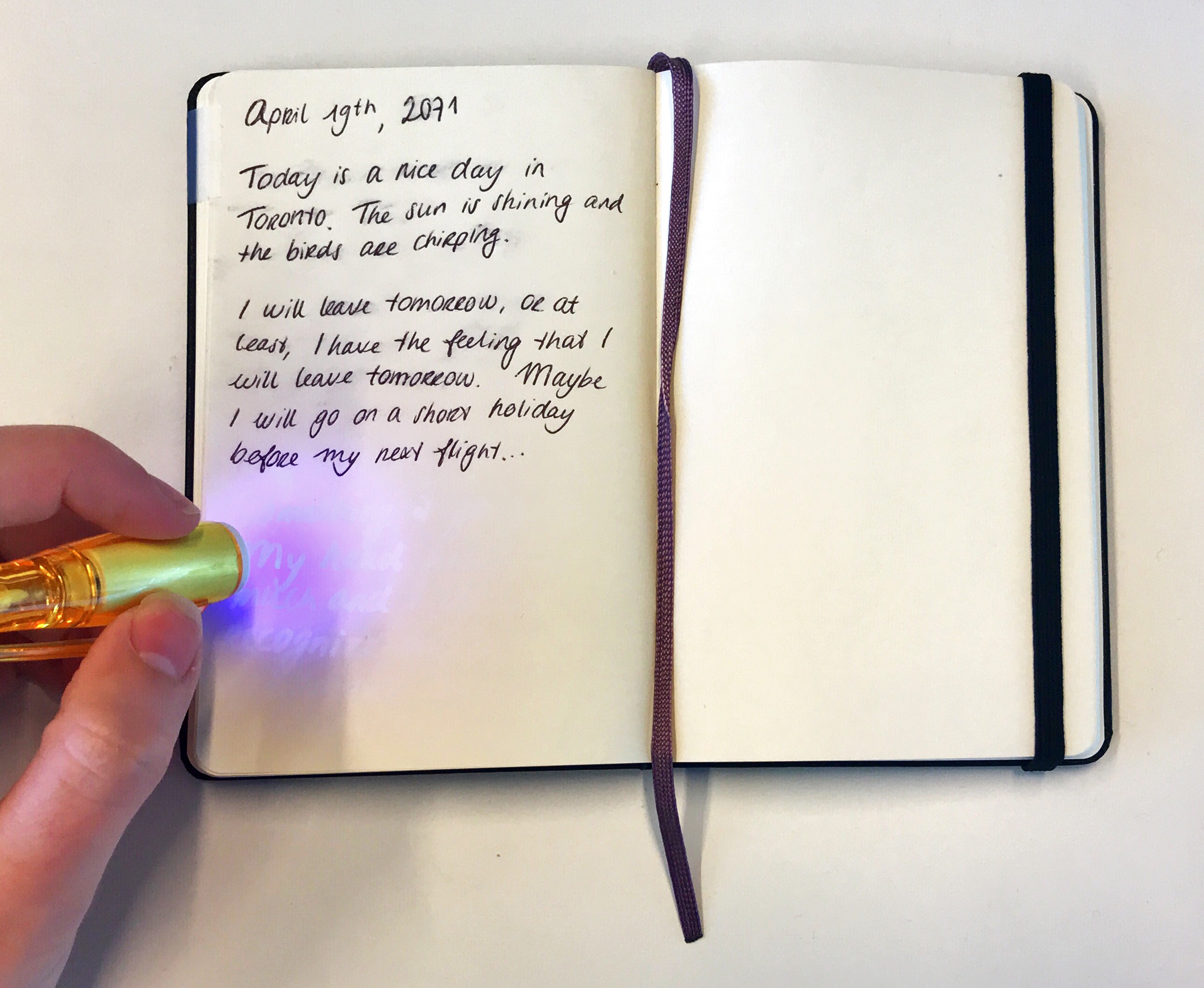
Besides the cockpit, I used a real notebook as a game element. The notebook is used as a diary of the pilot in the prototype. With an invisible ink pen I wrote a hidden message on the inside. With an ultraviolet light on the cap of the pen, the hidden message can be seen. This is a respresentation of the UV-tool in the game.

A puzzle was also part of the game I designed. I thought of a simple solution on how to implement a puzzle into the lo-fi prototype, namely to print a picture and cut it. This can be seen below.
Other methods
There are more interaction patterns that can be visualised in a simple way. For example, gaze direction hints are an interaction pattern as seen below.

To mimic gaze direction hints, you can draw an arrow drawn on a balloon and show it around during testing. In this way, the user knows where he needs to look.
Another interaction pattern of Mixed Reality is the gaze cursor. This cursor points at the thing the user looks at. This can be seen below.

A gaze cursor can be simulated with a small laser light attached to a frame of glasses. In this way, the laser light will show the user where he looks at.
Testing
The testing method I used was roleplay and partially the Wizard of Oz method. As seen in a picture above, I was executing all the interaction that the user was having. Besides that, I tried to recreate a cabin. The setup for testing can be seen below, with one of the participants making the puzzle.
Methods for hi-fi prototyping
First of all, I thought of making artist impressions of my ideas, but I soon found out that the easiest way to make a hi-fi prototype was to make a 3D environment. Even though I didn't have a lot of knowledge about 3D modelling, this was the easiest way.
I recreated the environment in which the game should be used in Blender. Besides that, I made 3D models of the elements of the game and put these into the 3D environment. After this, I animated a camera in Blender from the perspective of the user. You can see this in the video below.
Testing
Because I made a video as a hi-fi prototype, I had to find another way to test the interaction. The most important thing I wanted to find out if the interaction with the game would be really possible to execute in a small, cramped space, because the game would be used on a plane. Andrew J. Hunsucker inspired me with another quote:
The important part is that you get the space right. … If the space is supposed to be cramped, really jam them in there.
- Andrew J. Hunsucker
Because I wanted to let the participants really feel like they were in a cramped space, I gathered boxed and placed them around a chair to recreate a small space.
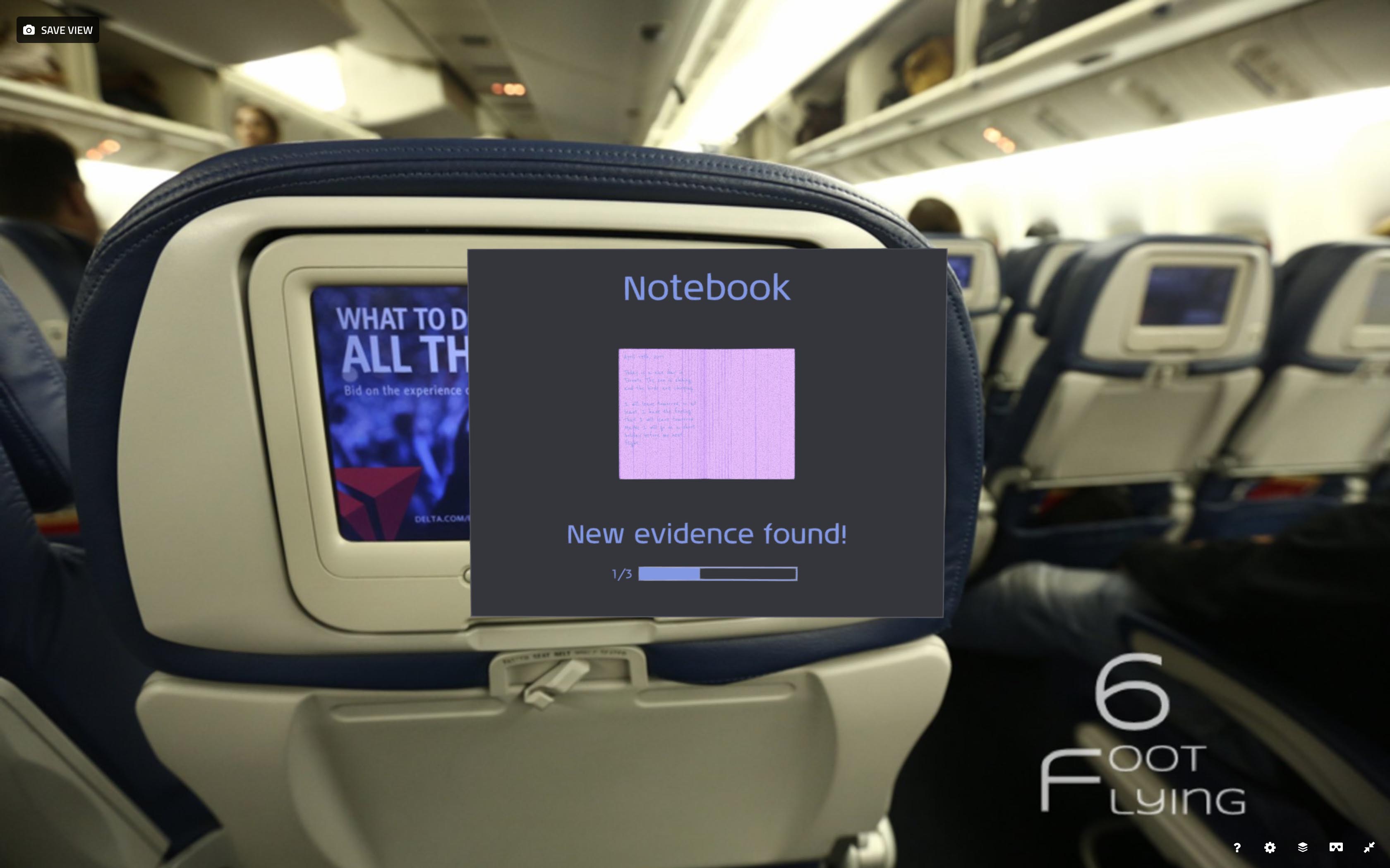
Besides giving the participant the feeling that he is in a cramped space, he needs to click on a remote. This is to find out whether the interaction is possible in the small space. I uploaded a 3D model of the cockpit and the interface that the notebook is found to Sketchfab. You can also see the interior of a plane in the background.

Future
I believe that there's a lot to improve for interaction and UX designers working on projects which involve Mixed Reality and other emerging technologies. An ideal situation for me would be a digital environment in which you can use simple 3D objects to create your vision of a Mixed Reality application.