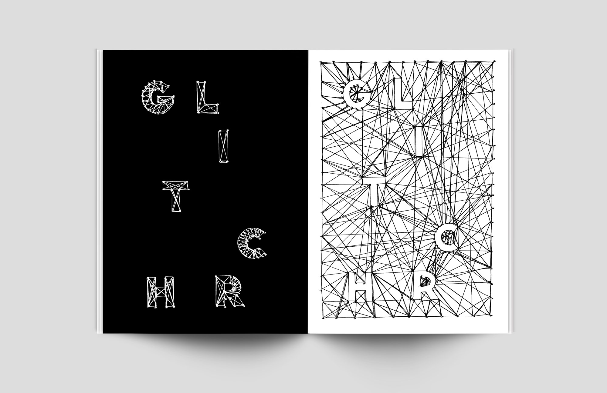
GLITCHR
GLITCHR is a magazine I made while I was doing a minor in Graphic Design. There are so many beautifully designed magazines out there, but most of them look the same. Therefore I felt like I had to develop my own style and my own perspective on how to show the content of a magazine.
What if a magazine is not designed perfectly? What if I made "mistakes" on purpose? What if I could show that bad design isn't that bad?
These questions were the base of the concept for GLITCHR. I wanted to show everyone that bad design, mistakes, flaws and glitches can also be beautiful.


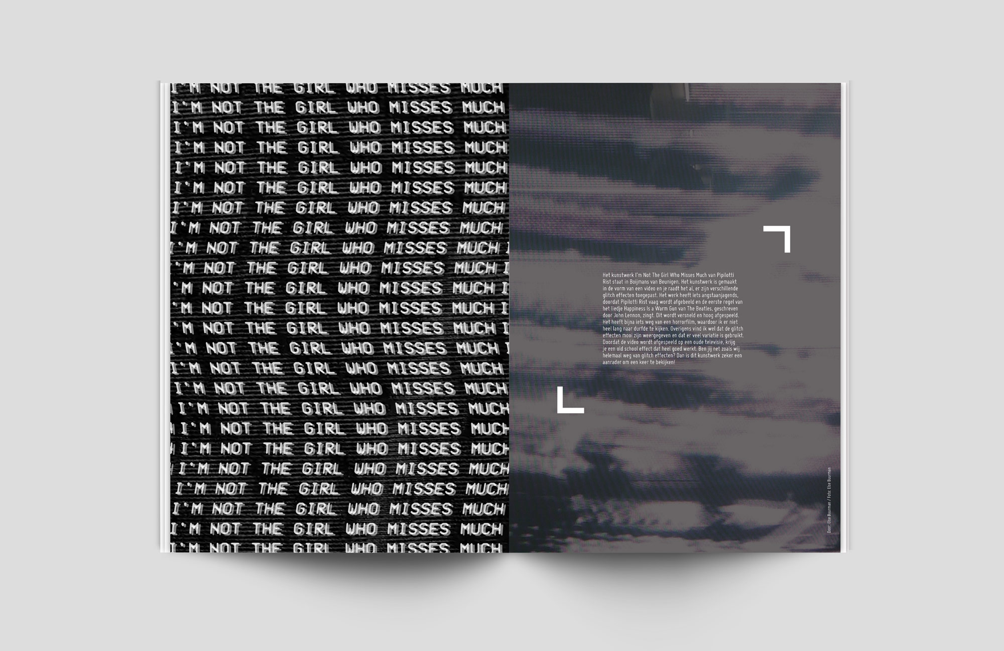
On the page on the right is a review of the eponymous work of Pipilotti Rist

The designing process also included thinking about the printing process and how everything would look like on paper. Also, I went a little further than that because I wanted to add something special to GLITCHR.
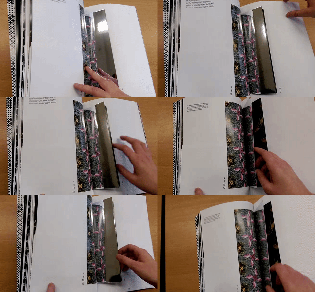
I thought of a way to make an offline magazine interactive by adding mirror paper. In this case, you can use the mirror paper to mirror the patterns I made.

GLITCHR was designed in Adobe InDesign. Photos were edited in Adobe Photoshop and Adobe Illustrator. Got a little curious and want to see magazine and touch it in real life? Give me a call or send me a message.